Crypto trading charts are the single most important tool for making informed buy and sell decisions — and learning to read them is easier than most beginners think. Whether you're tracking Bitcoin's next breakout or evaluating an altcoin entry, chart reading separates guesswork from strategy. This article walks you through every essential chart type, indicator, and pattern you need to analyze price action with confidence and start trading like a seasoned professional.
⚡ Key Takeaways:
- Candlestick charts are the standard for crypto traders — each candle reveals open, close, high, and low prices in a single glance.
- Support and resistance levels form the backbone of every chart-based trading decision.
- Moving averages, RSI, and MACD are the three indicators that cover 90% of what beginners need.
- Reading charts without a defined strategy still leads to emotional trading — pair your analysis with a clear plan.
Why Every Crypto Trader Needs to Read Charts
Price charts are a visual record of market sentiment. Every green candle represents buyers winning. Every red candle represents sellers taking control. When you learn to read crypto trading charts, you stop relying on headlines, social media hype, and gut feelings. You start making decisions based on data.
In 2026, over 560 million people hold cryptocurrency globally, and the daily trading volume across major exchanges exceeds $80 billion. That volume creates patterns — repeating, recognizable patterns that skilled chart readers exploit every single day. Professional traders at institutions use the exact same charts retail traders have access to. The difference isn't the tool. It's the skill to interpret what the chart is telling you.
Even if you rely on crypto trading signals or copy trading, understanding charts lets you evaluate whether a signal makes sense before you commit capital. It's the difference between following blindly and following intelligently.
Types of Crypto Trading Charts
Line Charts
A line chart is the simplest form of price visualization. It connects closing prices over a chosen timeframe with a continuous line. Line charts are useful for quickly spotting the overall trend direction — whether the market is moving up, down, or sideways — but they hide critical information about intra-period volatility.
If Bitcoin closed at $98,000 today and $99,500 yesterday, the line chart shows a gentle dip. But it won't show you that the price dropped to $95,200 intraday before recovering. For that level of detail, you need candlestick charts.
Candlestick Charts
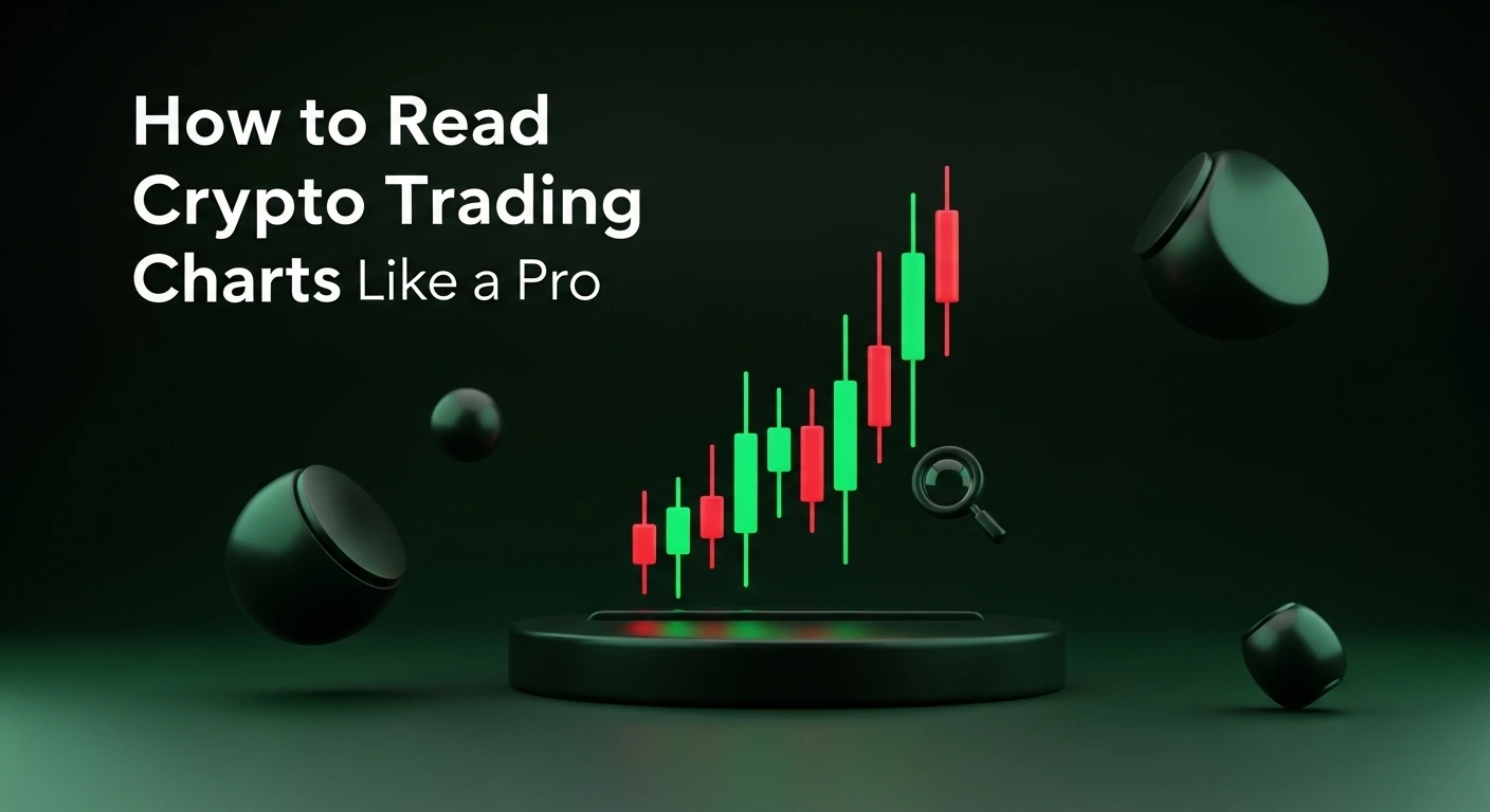
Candlestick charts are the industry standard for crypto traders, and for good reason. Each candlestick represents a specific time period — one minute, one hour, one day — and encodes four data points: the open price, close price, highest price, and lowest price within that period.
The thick body of the candle shows the range between open and close. If the close is higher than the open, the candle is typically green (bullish). If the close is lower, it's red (bearish). The thin lines extending above and below the body — called wicks or shadows — show the high and low extremes.
A long lower wick on a green candle, for example, tells a story: sellers pushed the price down aggressively, but buyers stepped in and drove it back above the open. That's a sign of buying pressure, and it often appears at the bottom of a downtrend.
Bar Charts (OHLC)
Bar charts display the same four data points as candlesticks — Open, High, Low, Close — but in a different visual format. Each bar is a vertical line showing the full range, with a small horizontal tick on the left marking the open and one on the right marking the close. Some traders prefer them for their cleaner look, but candlesticks dominate the crypto space because the color-coded bodies are faster to read at a glance.
How to Read Candlestick Patterns
Individual candlesticks tell micro-stories. Combinations of two or three candles tell macro-stories. Here are the patterns every beginner should memorize.
Single-Candle Patterns
- Doji: The open and close are nearly identical, creating a cross-shaped candle. A doji signals indecision — neither buyers nor sellers are in control. When it appears after a strong trend, it often signals a reversal is coming.
- Hammer: A small body at the top of the candle with a long lower wick (at least 2x the body length). Hammers appear at the bottom of downtrends and signal that buyers are stepping in aggressively. The bullish version is green; the bearish counterpart at the top of an uptrend is called a shooting star.
- Engulfing Candle: A large candle that completely engulfs the previous candle's body. A bullish engulfing pattern (green candle engulfing a red one) at a support level is one of the most reliable reversal signals in crypto.
Multi-Candle Patterns
- Morning Star: A three-candle pattern at the bottom of a downtrend — a bearish candle, followed by a small-bodied candle (the indecision), followed by a strong bullish candle. It signals a reversal from bearish to bullish momentum.
- Evening Star: The inverse of the morning star, appearing at the top of an uptrend. Bearish reversal signal.
- Three White Soldiers: Three consecutive bullish candles with progressively higher closes. Strong confirmation that an uptrend is underway.
These patterns work best when they appear at key price levels — which brings us to support and resistance.
Understanding Support and Resistance on Crypto Trading Charts
Support is a price level where buying pressure historically outweighs selling pressure, causing the price to bounce upward. Resistance is the opposite — a ceiling where sellers consistently overpower buyers, pushing the price back down.
Identifying these levels is arguably the most valuable skill in chart reading. Every strategy — from swing trading to signal-based trading — relies on support and resistance zones to define entry points, exit points, and stop-loss placement.
How to Find Support and Resistance
Look for price levels where the chart has reversed direction multiple times. If Ethereum has bounced off $3,200 three times in the past month, that's a strong support level. If it's been rejected at $3,800 twice, that's resistance. The more times a level is tested, the stronger it becomes — but when it finally breaks, the move is often explosive.
Round numbers (e.g., $100,000 for BTC, $4,000 for ETH) frequently act as psychological support and resistance because human traders cluster orders at these levels. Previous all-time highs and significant swing lows also create lasting reference points on the chart.
The Flip: When Support Becomes Resistance
One of the most powerful concepts in chart analysis is the support-resistance flip. When a support level is broken, it frequently becomes resistance on any retest. If Bitcoin breaks below $95,000 support, a bounce back to $95,000 will likely be met with selling — former buyers who are now underwater will sell to break even, turning old support into new resistance.
Essential Technical Indicators for Crypto Charts
Candlesticks and support/resistance give you the raw price structure. Technical indicators add a layer of mathematical confirmation. You don't need dozens of indicators. Three core tools cover the vast majority of scenarios.
Moving Averages (MA)
A moving average smooths out price data to reveal the underlying trend. The two most common types are the Simple Moving Average (SMA) and the Exponential Moving Average (EMA). The EMA gives more weight to recent prices, making it react faster to current conditions.
Key moving averages for crypto traders:
- 20 EMA: Short-term trend gauge. If the price is above the 20 EMA, the short-term bias is bullish.
- 50 SMA: Medium-term trend. Swing traders use this as a dynamic support/resistance level.
- 200 SMA: Long-term trend. The "line in the sand" for institutional traders. When the price is above the 200 SMA, the broader trend is considered bullish.
The golden cross — when the 50 SMA crosses above the 200 SMA — is a widely watched bullish signal. The death cross — the 50 crossing below the 200 — signals bearish momentum. Bitcoin's golden cross in late 2024 preceded a rally of over 90% within six months.
Relative Strength Index (RSI)
The RSI measures momentum on a scale of 0 to 100. Readings above 70 indicate the asset is overbought — a potential sell signal or at least a reason to hold off on buying. Readings below 30 indicate the asset is oversold — a potential buying opportunity.
The real power of RSI comes from divergence. If Bitcoin's price makes a higher high but the RSI makes a lower high, that's bearish divergence — a warning that the uptrend is losing steam. Conversely, if the price makes a lower low but RSI makes a higher low, bullish divergence suggests a reversal may be coming.
MACD (Moving Average Convergence Divergence)
The MACD consists of two lines — the MACD line and the signal line — plus a histogram that shows the difference between them. When the MACD line crosses above the signal line, it generates a bullish signal. When it crosses below, it's bearish.
MACD works best on higher timeframes (4-hour and daily charts). On 1-minute or 5-minute charts, it produces too many false signals. For swing traders and position traders, the MACD is a reliable trend-confirmation tool that helps filter out noise.
Chart Patterns That Signal Breakouts and Reversals
Beyond individual candlesticks, price forms larger geometric patterns that forecast the next major move. These patterns fall into two categories: continuation patterns (the trend will resume) and reversal patterns (the trend will change direction).
Continuation Patterns
| Pattern | Shape | Signal |
|---|---|---|
| Bull Flag | Sharp move up, followed by a downward-sloping channel | Breakout upward; trend continuation |
| Ascending Triangle | Flat resistance line with rising support | Bullish breakout above resistance |
| Symmetrical Triangle | Converging support and resistance lines | Breakout in the direction of the prior trend |
| Pennant | Small symmetrical triangle after a sharp price spike | Continuation of the spike direction |
Reversal Patterns
| Pattern | Shape | Signal |
|---|---|---|
| Head and Shoulders | Three peaks — the middle is tallest | Bearish reversal after an uptrend |
| Inverse Head and Shoulders | Three troughs — the middle is deepest | Bullish reversal after a downtrend |
| Double Top | Two peaks at approximately the same price level | Bearish reversal |
| Double Bottom | Two troughs at approximately the same price level | Bullish reversal |
Volume is the confirmation key. A pattern breakout on high volume is far more reliable than one on low volume. Always check trading volume before acting on any chart pattern.
Reading Volume on Crypto Charts
Volume measures how many units of a cryptocurrency were traded during a given period. It's displayed as bars beneath the price chart. Volume is the fuel behind price moves — without it, even the most promising breakout will fizzle out.
Here's how to use volume effectively:
- Rising price + rising volume = healthy uptrend. Buyers are committed.
- Rising price + declining volume = weakening uptrend. Buyer enthusiasm is fading — be cautious.
- Breakout + volume spike = confirmed breakout. Enter with conviction.
- Breakout + low volume = potential fakeout. Wait for confirmation.
Volume spikes at key support levels can also indicate that large players (whales) are accumulating. If you see a massive volume bar at support with the price holding steady, institutions may be loading up — a bullish sign.
Timeframes: Which Chart Should You Be Looking At?
Every chart can be viewed on different timeframes, from 1-minute to monthly. The timeframe you choose should match your trading strategy.
| Trader Type | Primary Timeframe | Confirmation Timeframe |
|---|---|---|
| Scalper | 1-minute / 5-minute | 15-minute |
| Day Trader | 15-minute / 1-hour | 4-hour |
| Swing Trader | 4-hour / Daily | Weekly |
| Position Trader | Daily / Weekly | Monthly |
A best practice called multi-timeframe analysis involves checking the trend on a higher timeframe before making decisions on your trading timeframe. If the daily chart shows Bitcoin in a clear uptrend, you only take long setups on the 4-hour chart. This alignment dramatically improves your win rate.
Many experienced traders who use professional signal services still verify the setup on their own charts across multiple timeframes before entering a position.
Putting It All Together: A Step-by-Step Chart Reading Process
Here's a practical workflow you can follow every time you sit down to analyze a crypto trading chart:
- Identify the trend on the daily chart using moving averages. Is the price above or below the 200 SMA?
- Mark key support and resistance levels — draw horizontal lines at recent swing highs and lows.
- Drop down to your trading timeframe (4-hour for swing traders) and look for candlestick patterns at those key levels.
- Confirm with indicators — check RSI for overbought/oversold conditions and MACD for crossover signals.
- Check volume — is the pattern supported by increasing volume?
- Define your trade — entry price, stop-loss, and take-profit before clicking the buy button.
This process takes five to ten minutes per chart. It removes emotion from the equation and replaces it with a repeatable system. Combine this skill with insights from cryptocurrency trading signal providers and you have a robust decision-making framework.
Common Chart Reading Mistakes to Avoid
- Indicator overload: Adding 10 indicators to your chart creates confusion, not clarity. Stick to two or three core indicators and master them.
- Ignoring the higher timeframe: A bullish setup on the 15-minute chart means nothing if the daily chart is in a clear downtrend.
- Trading every pattern: Not every doji or hammer is actionable. Context matters — a hammer at a major support level is far more significant than one in the middle of a range.
- Confirmation bias: Seeing what you want to see on the chart instead of what the data actually shows. If you've already decided to buy, you'll find reasons to justify it. Let the chart lead; don't force a narrative.
- Skipping volume analysis: Price tells you what happened. Volume tells you whether it matters. Always include volume in your analysis.
Frequently Asked Questions
What is the best chart type for reading crypto prices?
Candlestick charts are the most widely used and informative chart type for cryptocurrency trading. Each candle shows the open, close, high, and low for a given period, giving you a complete picture of market activity. Over 85% of professional crypto traders use candlestick charts as their primary analysis tool, according to data from Investopedia.
How long does it take to learn to read crypto charts?
Most traders develop a functional understanding of chart reading within two to four weeks of daily practice. Mastering pattern recognition and indicator interpretation takes longer — typically three to six months. Start by studying one chart per day, identifying trends, support/resistance levels, and key candlestick patterns. Combine your study with a signal group for real-world context on how professionals interpret the same data.
Do I need paid tools to read crypto charts?
No. TradingView offers a powerful free tier with full candlestick charts, dozens of indicators, and community-shared ideas. Exchange platforms like Binance and Coinbase also include built-in charting tools. Paid plans add features like more indicators per chart and real-time alerts, but they're not necessary at the beginner level.
Can chart analysis predict crypto prices accurately?
Chart analysis identifies probabilities, not certainties. No indicator or pattern guarantees a specific outcome. What technical analysis does is tilt the odds in your favor — if you consistently take trades with a 60% historical success rate and manage risk properly, you will be profitable over a large sample of trades. The goal is an edge, not perfection.
What timeframe should beginners start with?
The daily chart is the best starting point for beginners. It filters out the noise and false signals common on lower timeframes, gives you more time to analyze and make decisions, and aligns well with strategies like swing trading. Once you're comfortable reading daily charts, you can explore the 4-hour chart for more precise entries and exits.
Final Thoughts
Learning to read crypto trading charts is not optional if you want to trade seriously — it's foundational. Candlestick patterns reveal market psychology. Support and resistance define the battlefield. Moving averages, RSI, and MACD provide the confirmation layer that turns a visual hunch into a data-backed decision.
You don't need to master every pattern on day one. Start with candlestick basics, identify support and resistance on the daily chart, and add one indicator at a time. Within a few weeks of deliberate practice, you'll be reading charts with the same fluency as traders who've been at it for years. Combine your chart skills with reliable signal providers and a solid risk management framework, and you'll have every tool you need to trade crypto like a professional.
The market speaks through its charts. Once you learn the language, the opportunities become impossible to miss.
⚠️ Disclaimer: Trading cryptocurrencies involves significant risk. This content is educational and not financial advice. Past performance does not guarantee future results.
Explore Our Crypto Signal Pages